The Torn Project
Brand Identity
Years of research. Hundreds of interviews. Countless stories of struggle and hope. The Torn Project began as a treasure trove of human experience, thought leadership, and practical tools for navigating inner conflict—but lacked a unifying visual identity to amplify its purpose in the world.
Our challenge: to translate this profound body of work into a brand identity and visual storytelling system as dynamic and deeply human as the stories it holds.
The Torn Project is dedicated to exploring inner conflict—the universal tension between opposing needs and desires. Here, real human stories meet reliable tools and reassuring expertise, forming a thought leadership framework that is as practical as it is profound.
Guided by the insight that the push and pull of inner conflict is not simply something to be resolved, but a source of movement, creativity, and growth, we set out to create a visceral, emotionally charged identity—real and relatable, confident and credible, and always rooted in humanity.
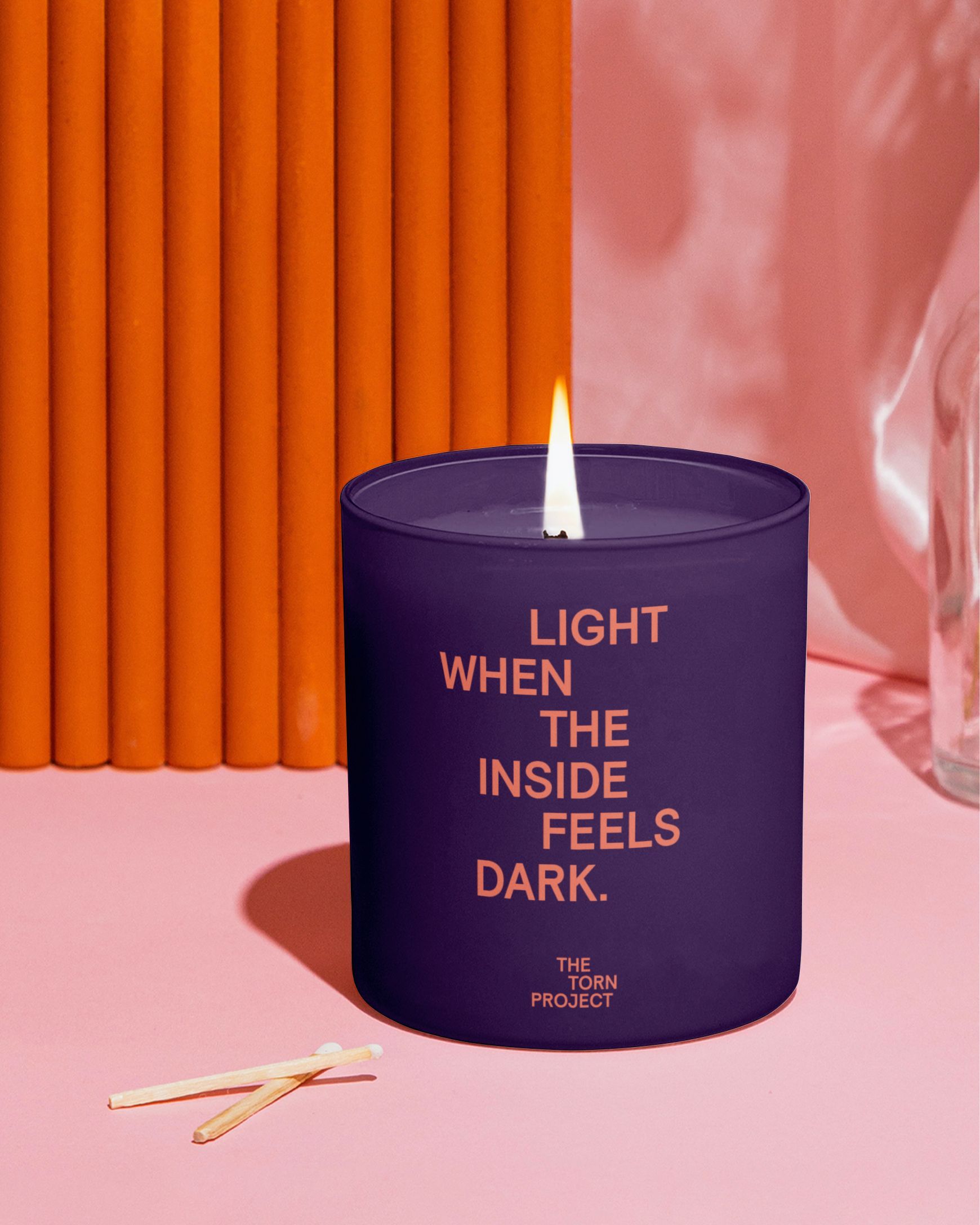
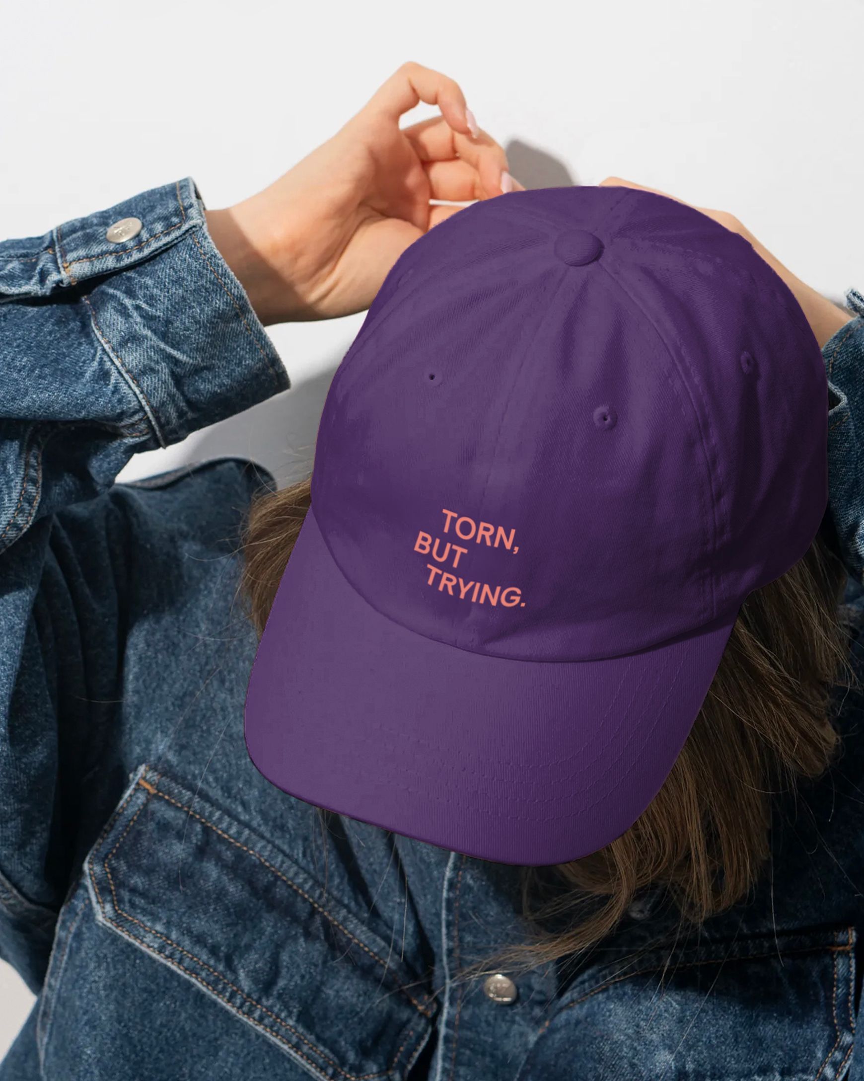
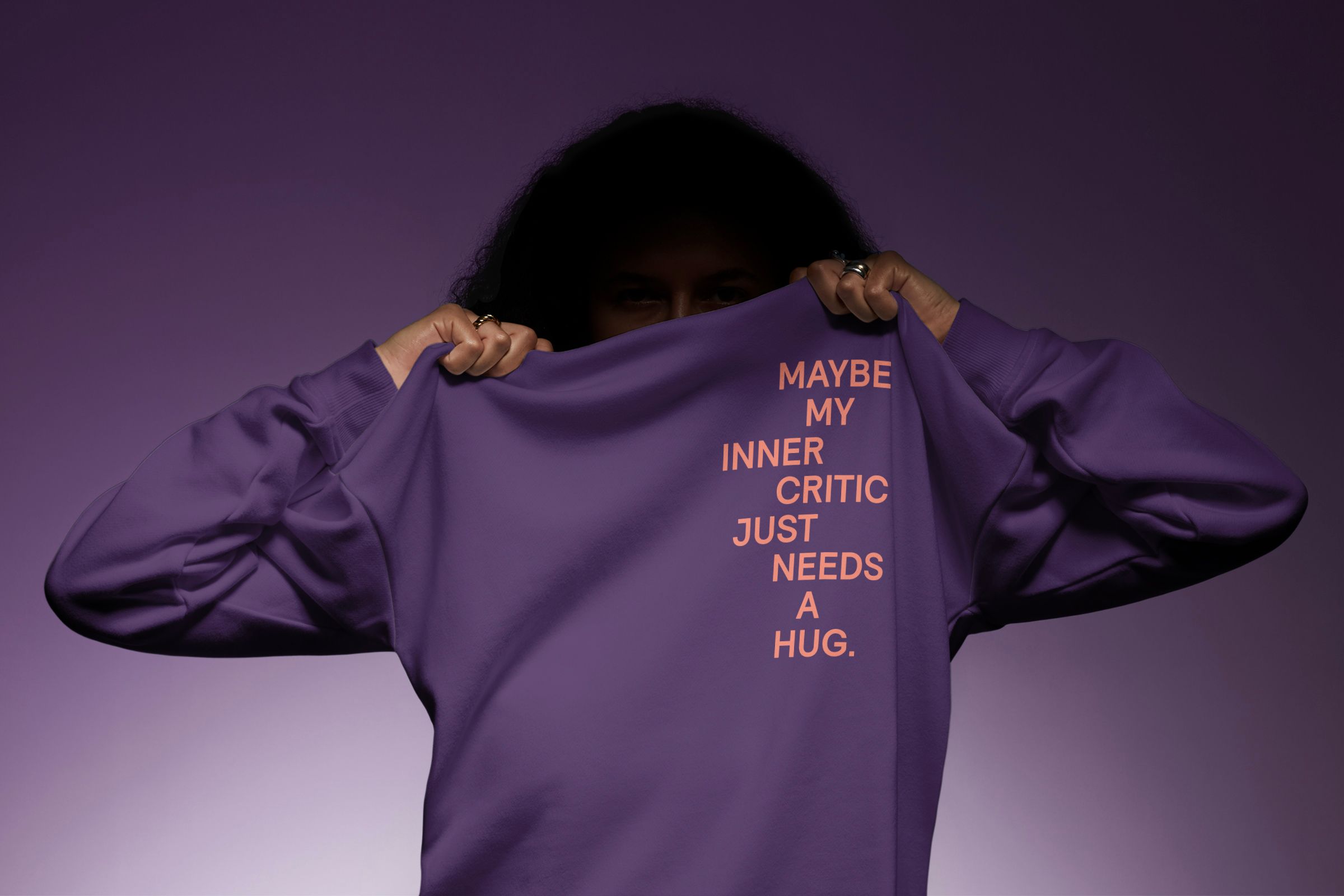
To embody the core of The Torn Project, we crafted a visceral identity that doesn’t shy away from tension—it celebrates it.
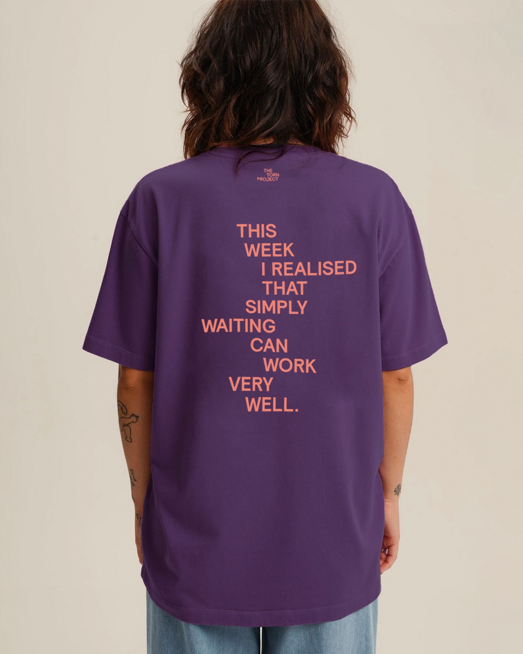
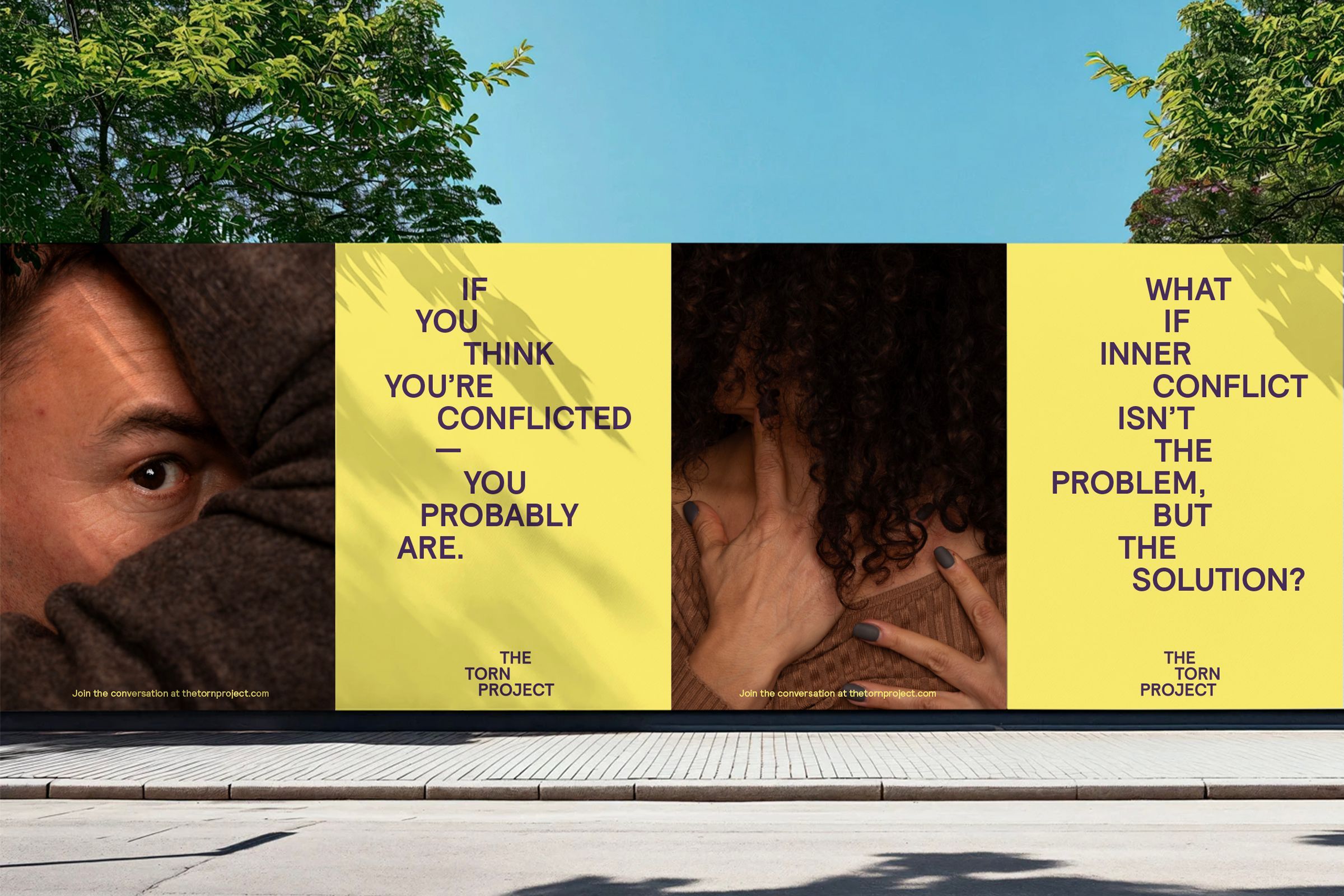
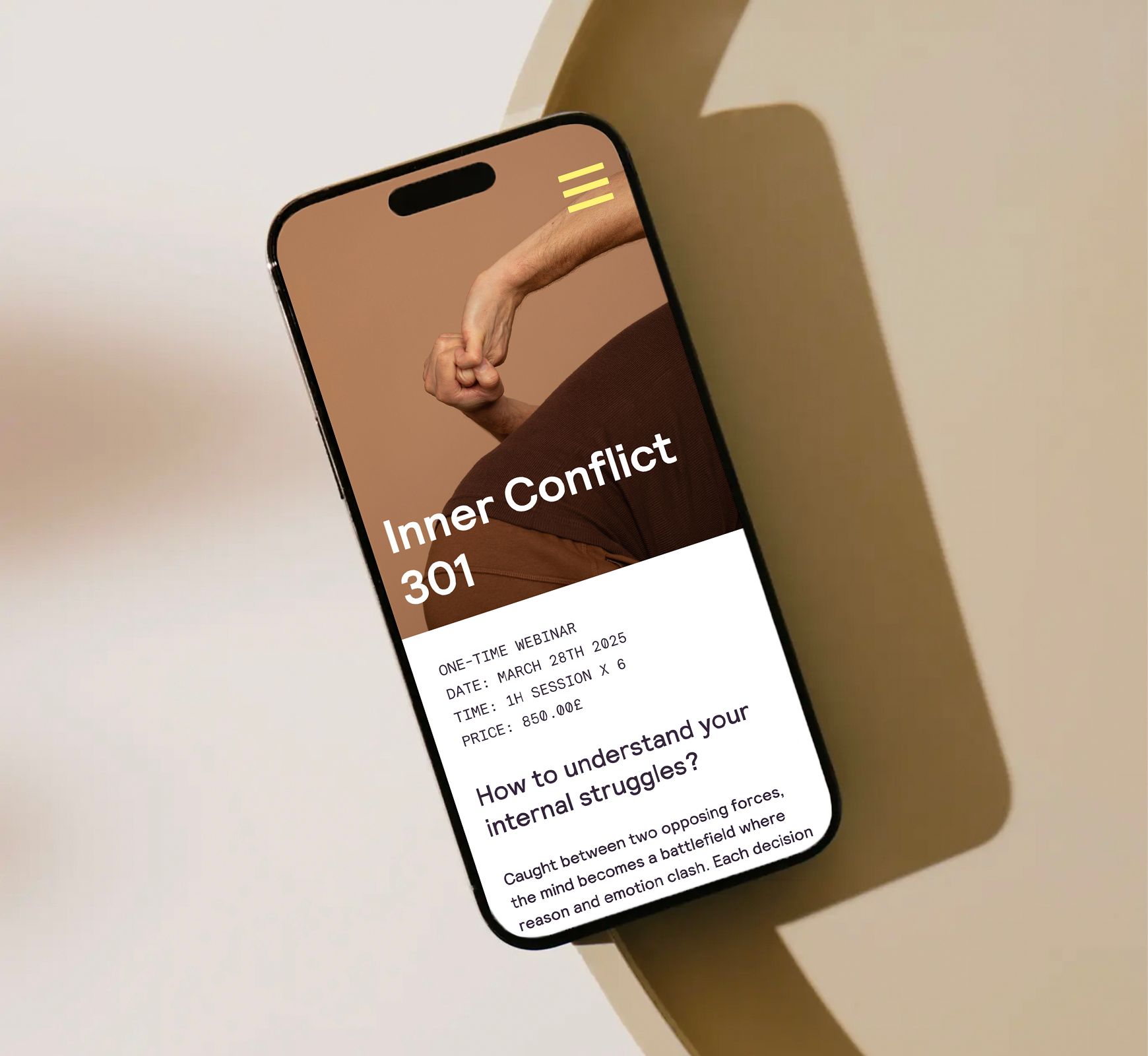
At the centre of the brand identity is a dynamic typographic system, designed as a visual metaphor for the restless push and pull of inner conflict, echoing the sensation of being torn in different directions.
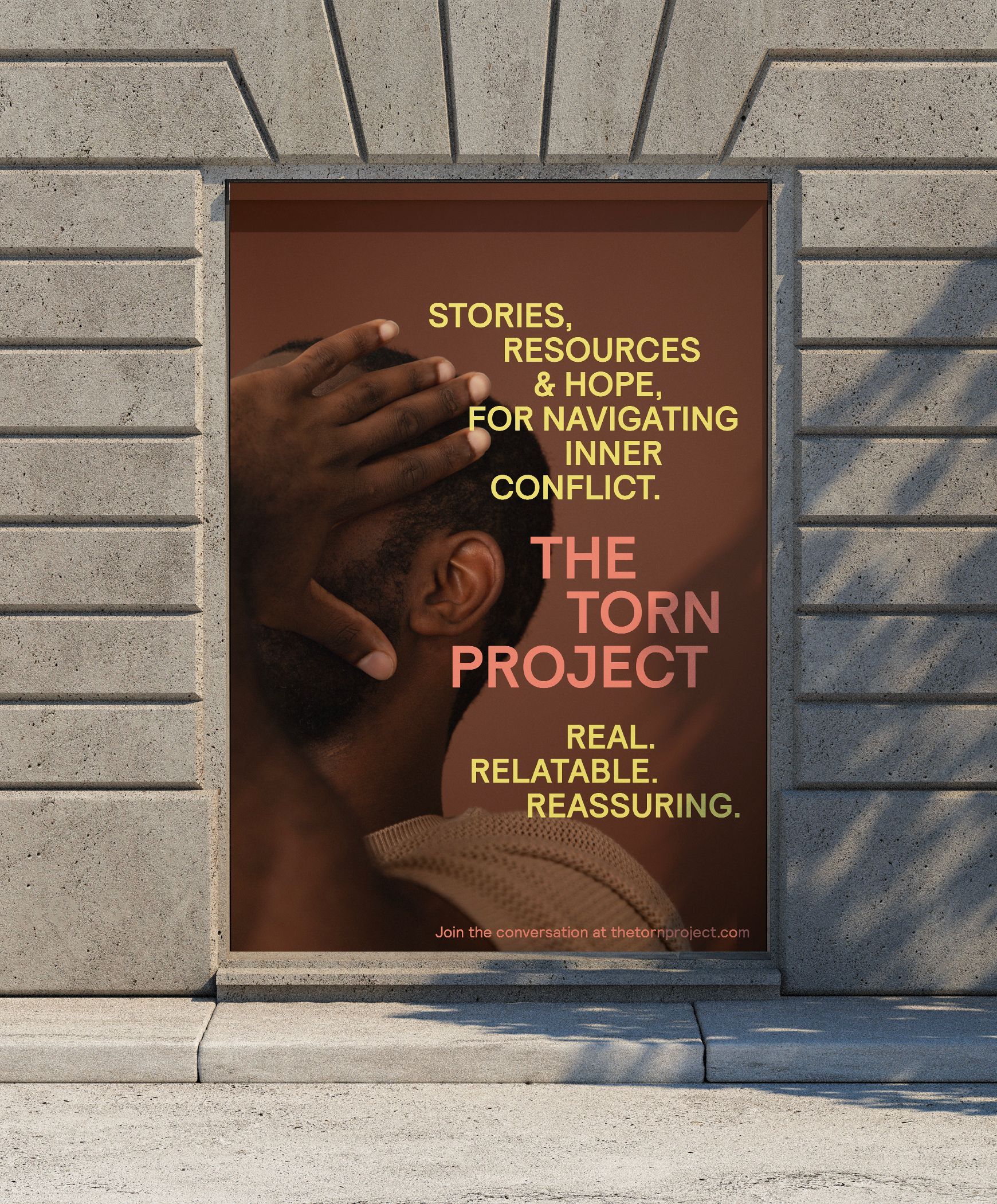
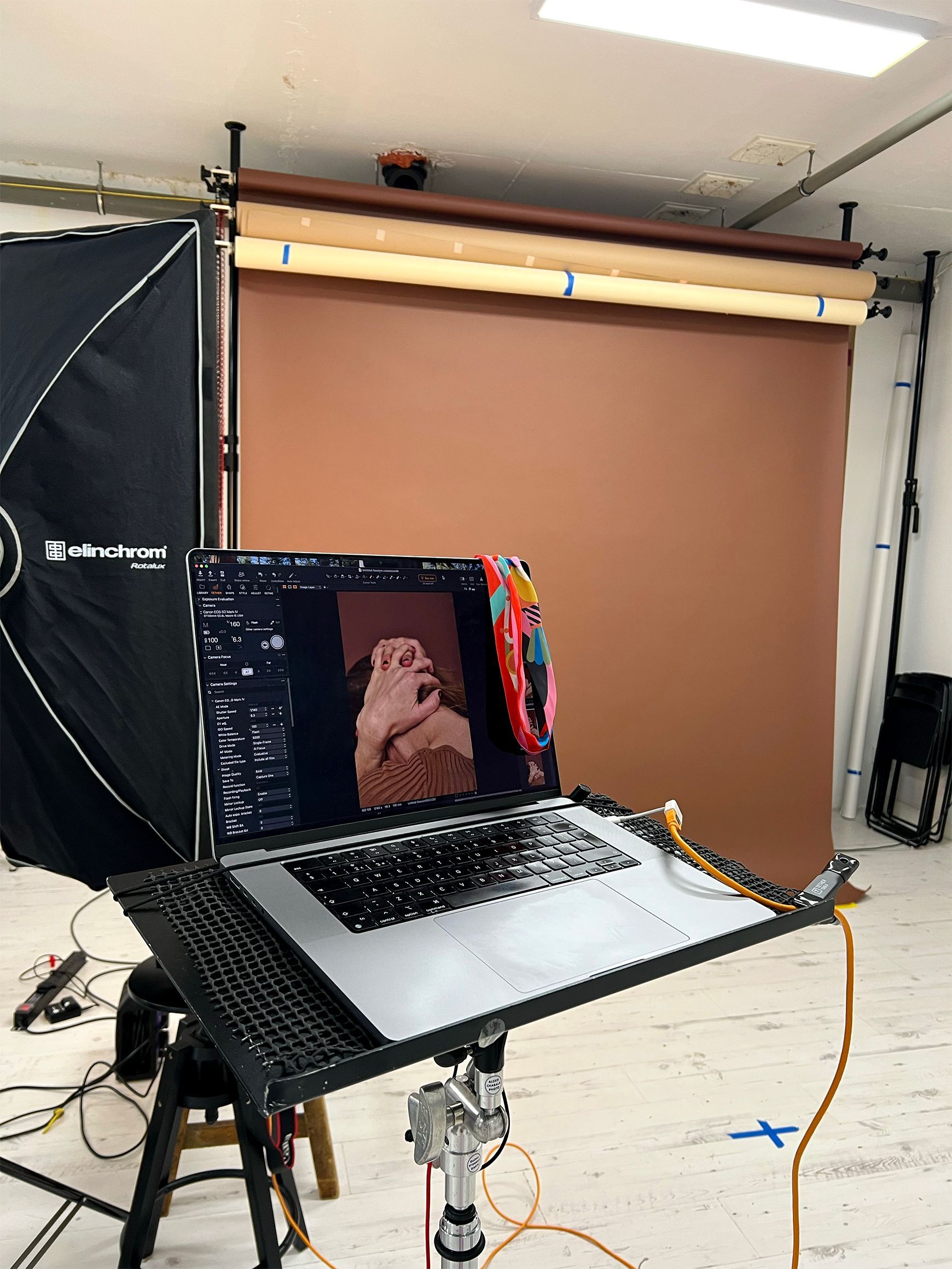
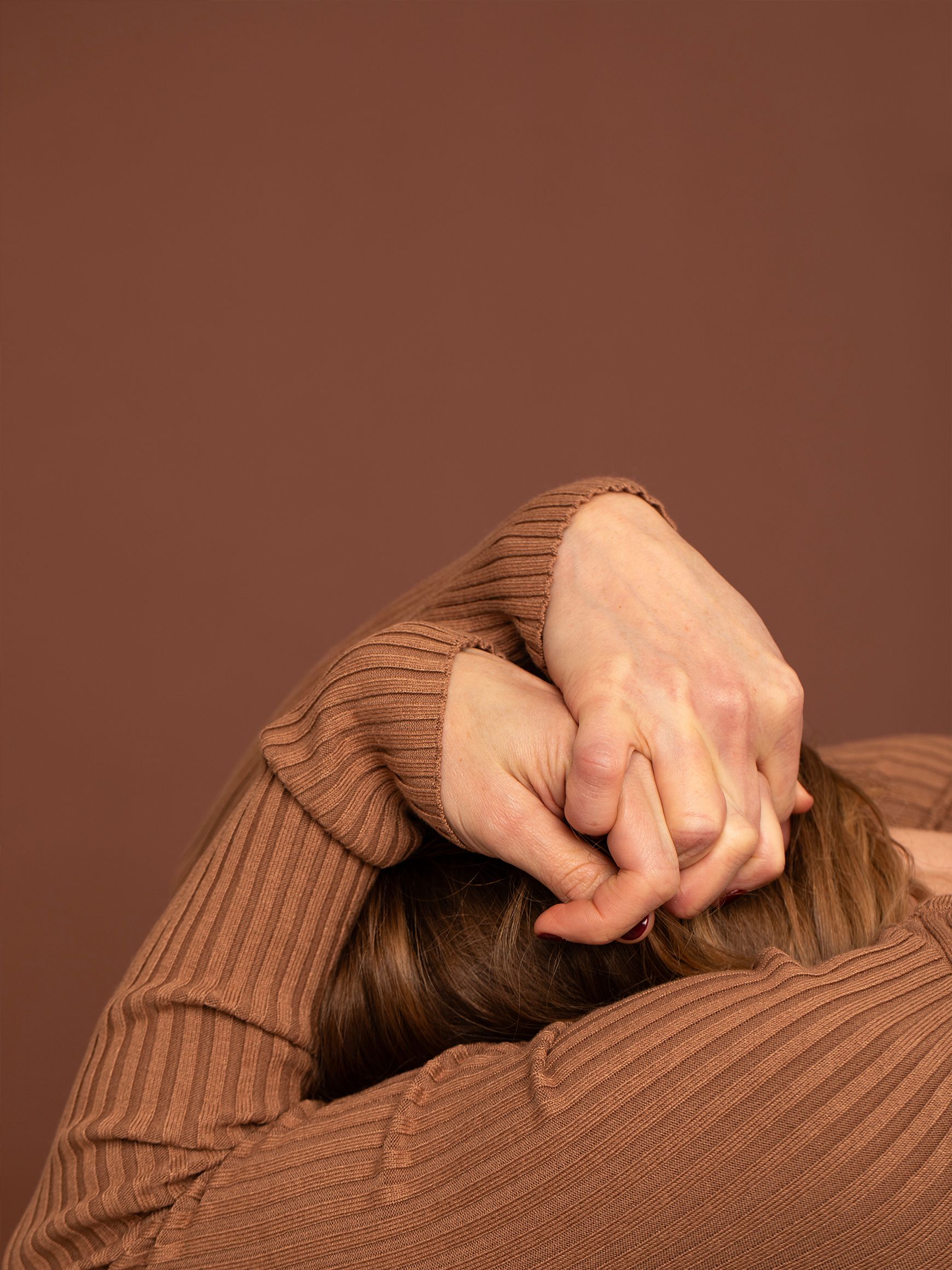
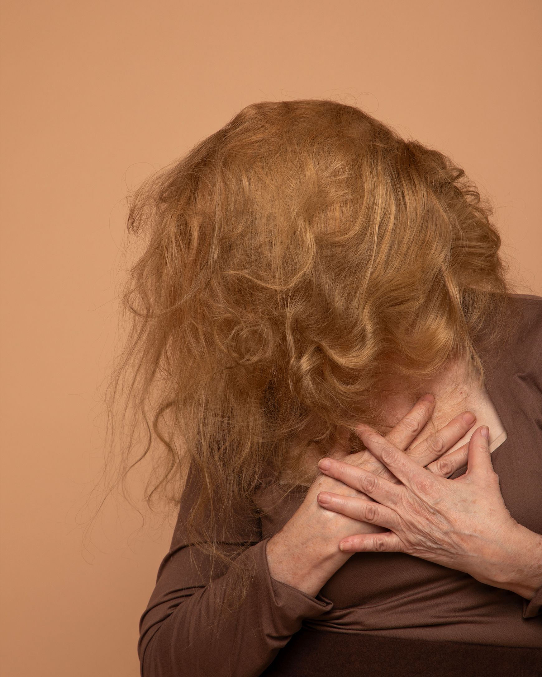
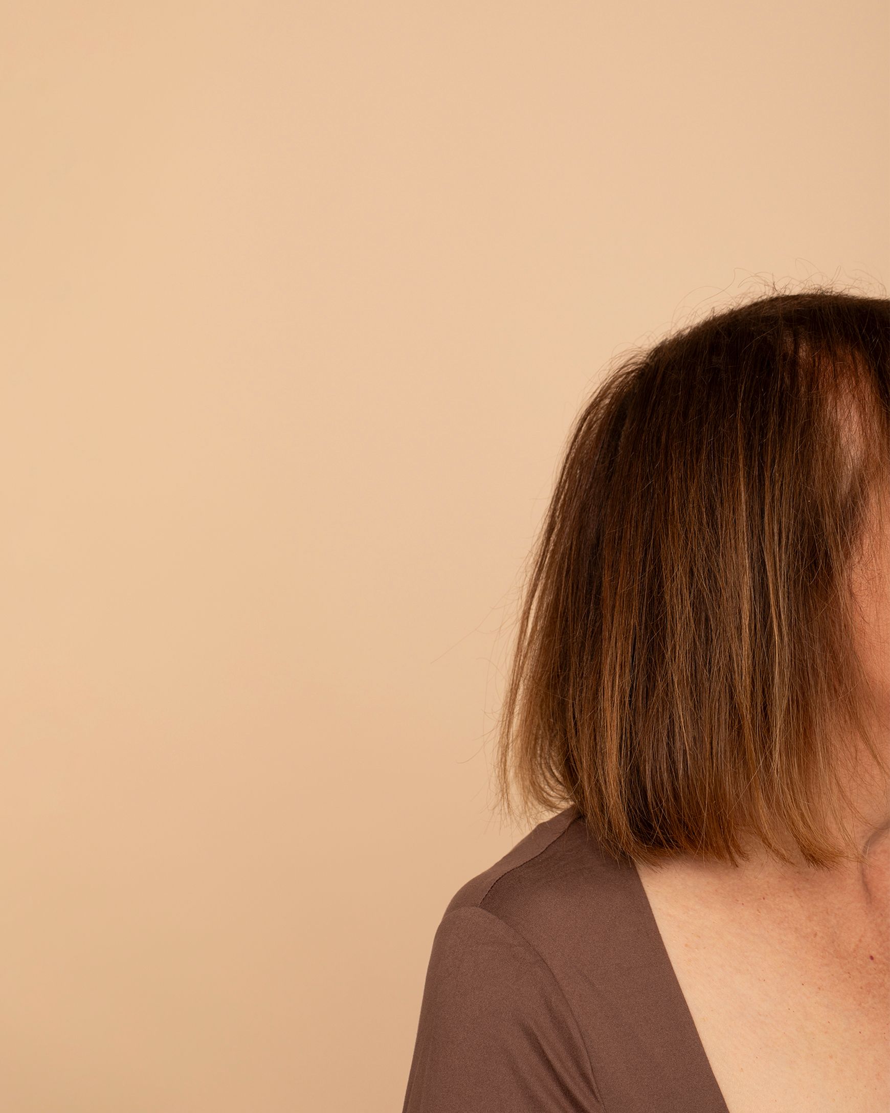
Our two-day photoshoot in London brought the many faces and stages of inner conflict to life, capturing a diverse cast as they embodied the full spectrum of struggle, release, and resolution.
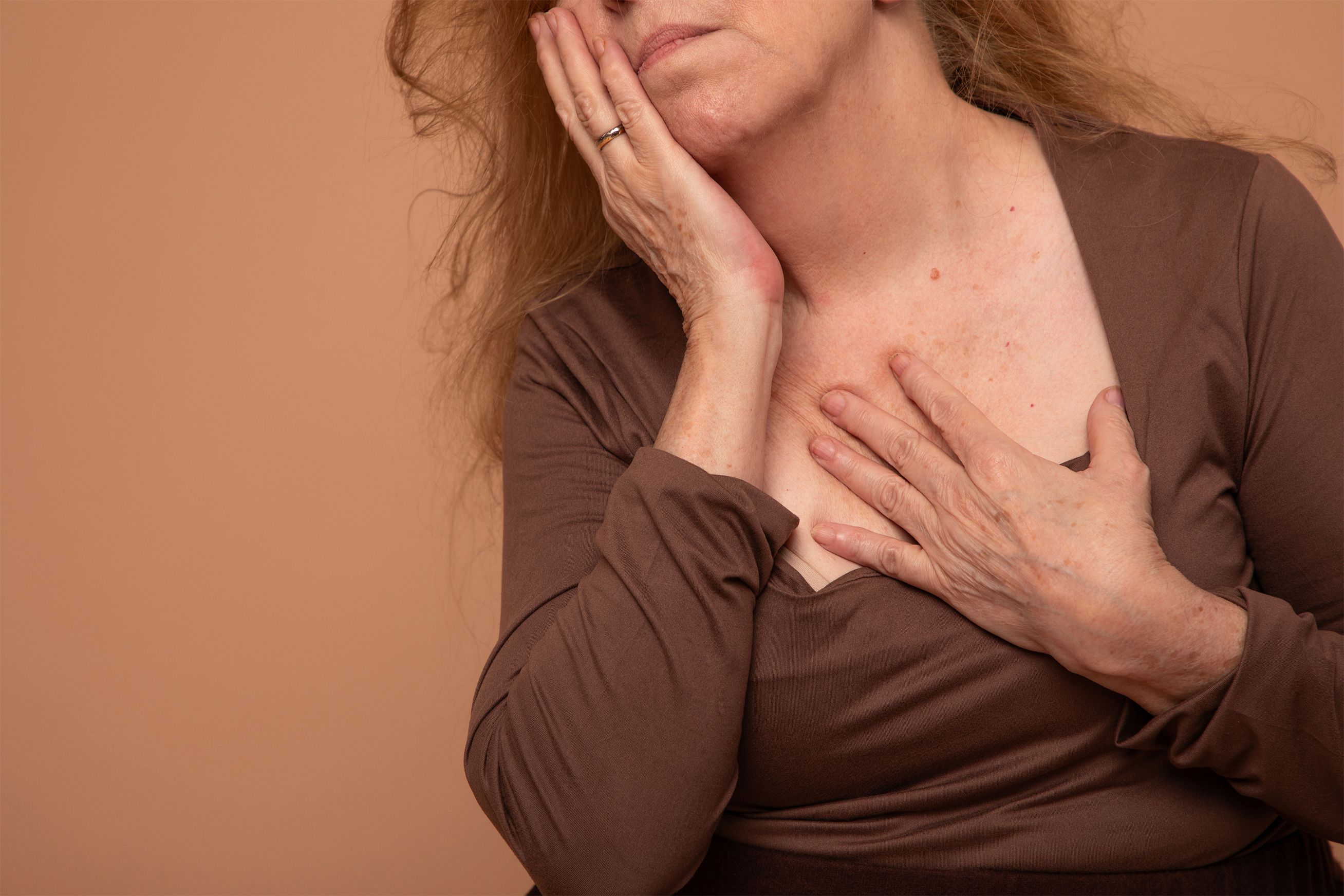

What if the struggle was a dance, where every emotion was invited to move? Instead of simply directing poses, we guided participants through real scenarios of being torn, encouraging them to authentically explore and express their inner states. Seeking a visual language of unexpected postures, somatic shapes, and expressive close-ups-all set against a monochromatic palette of nude tones-we created a library of evocative images and short films that make the invisible visible, distilling raw emotion, nuance, and pure humanity into every frame.
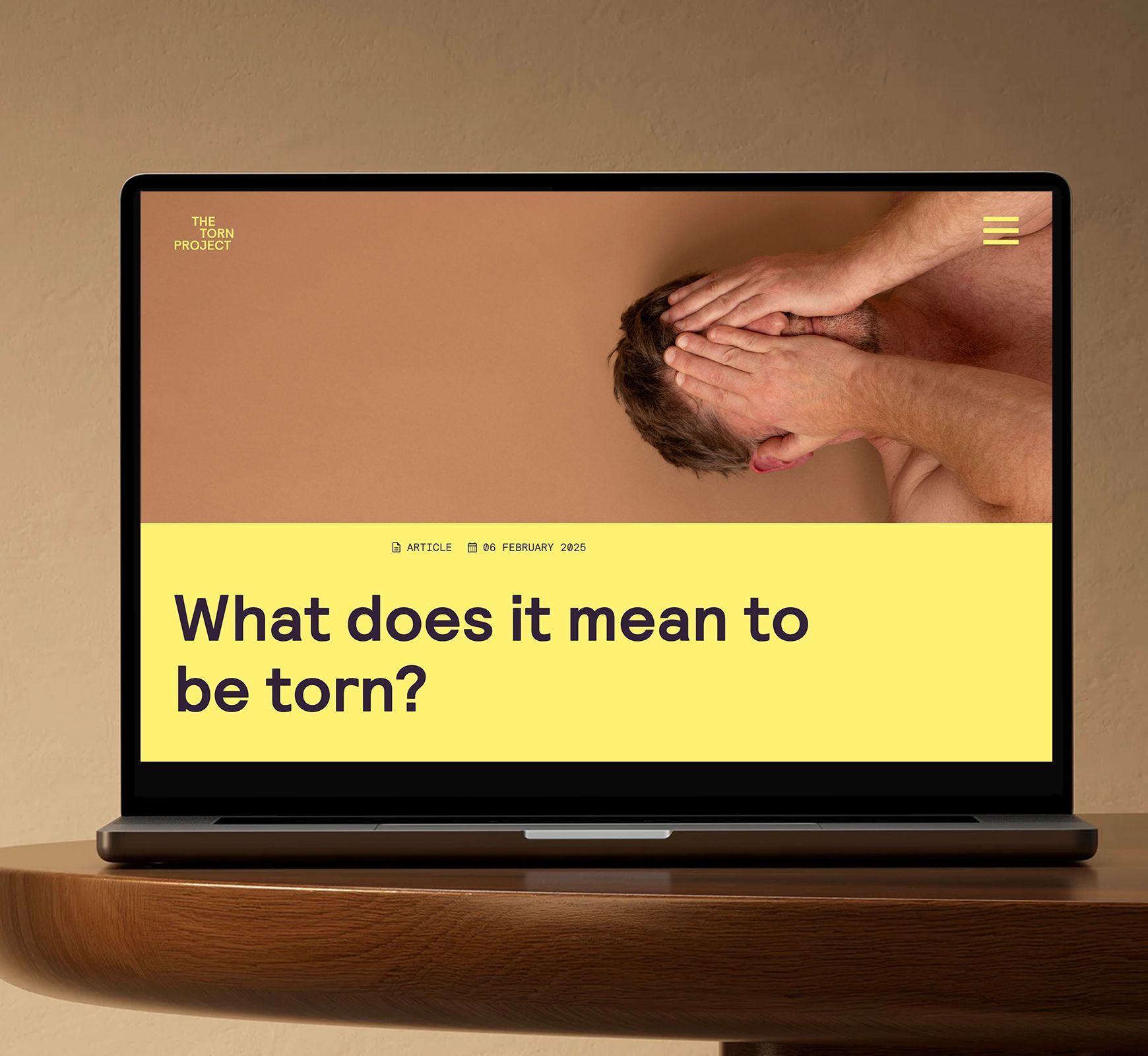
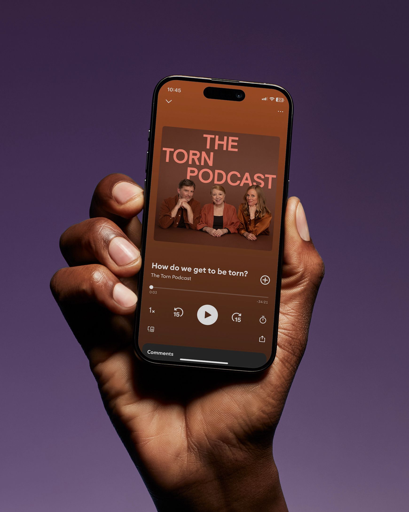
The website is the beating heart of The Torn Project—where stories, expertise, practical tools, and deep-dive learning journeys converge under one digital roof. Designed to turn complexity into clarity, the site transforms a story-driven approach into an intuitive experience: inviting, accessible, and visually charged, it guides users through a landscape of resources and hope with warmth and reassurance.
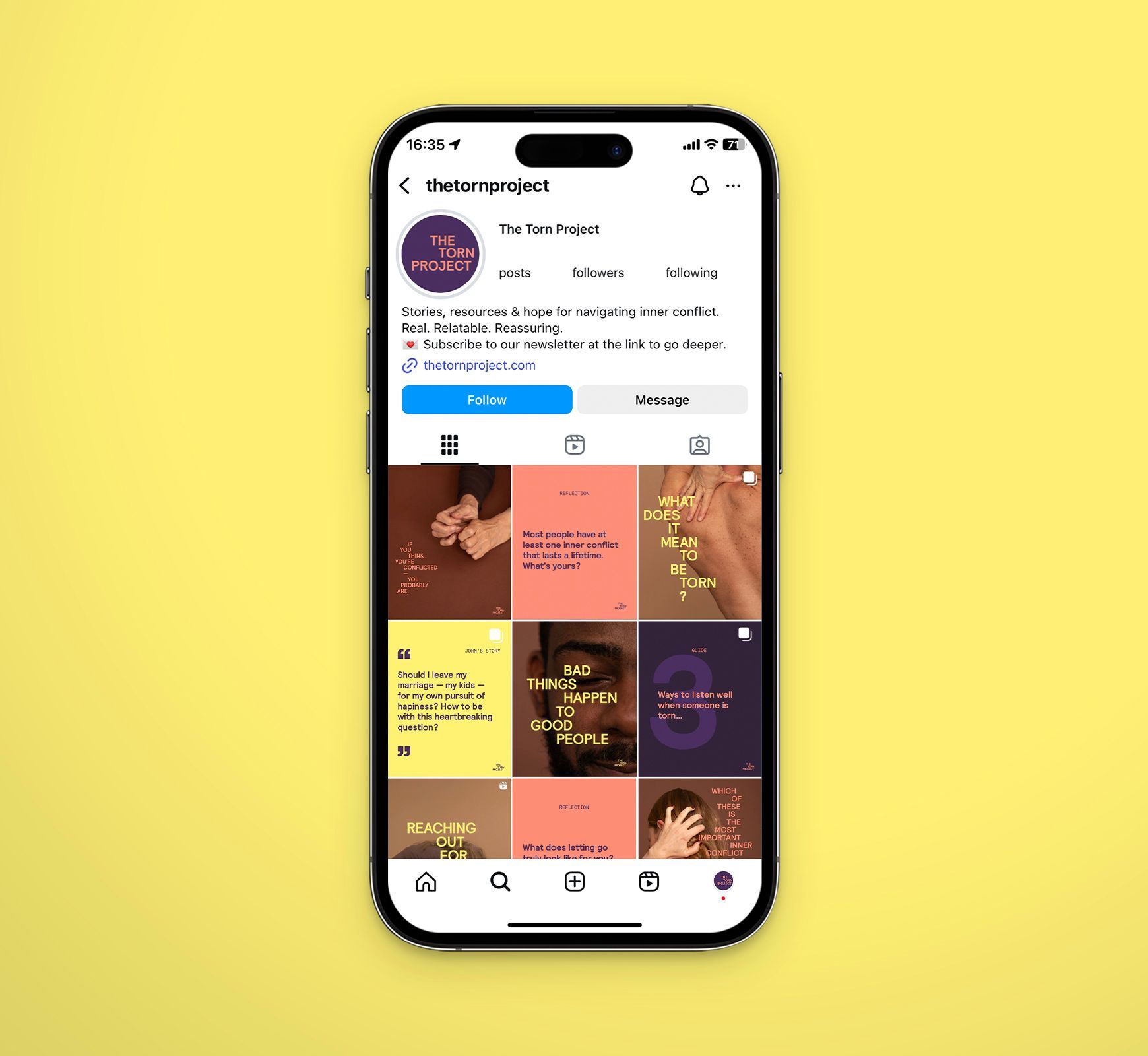
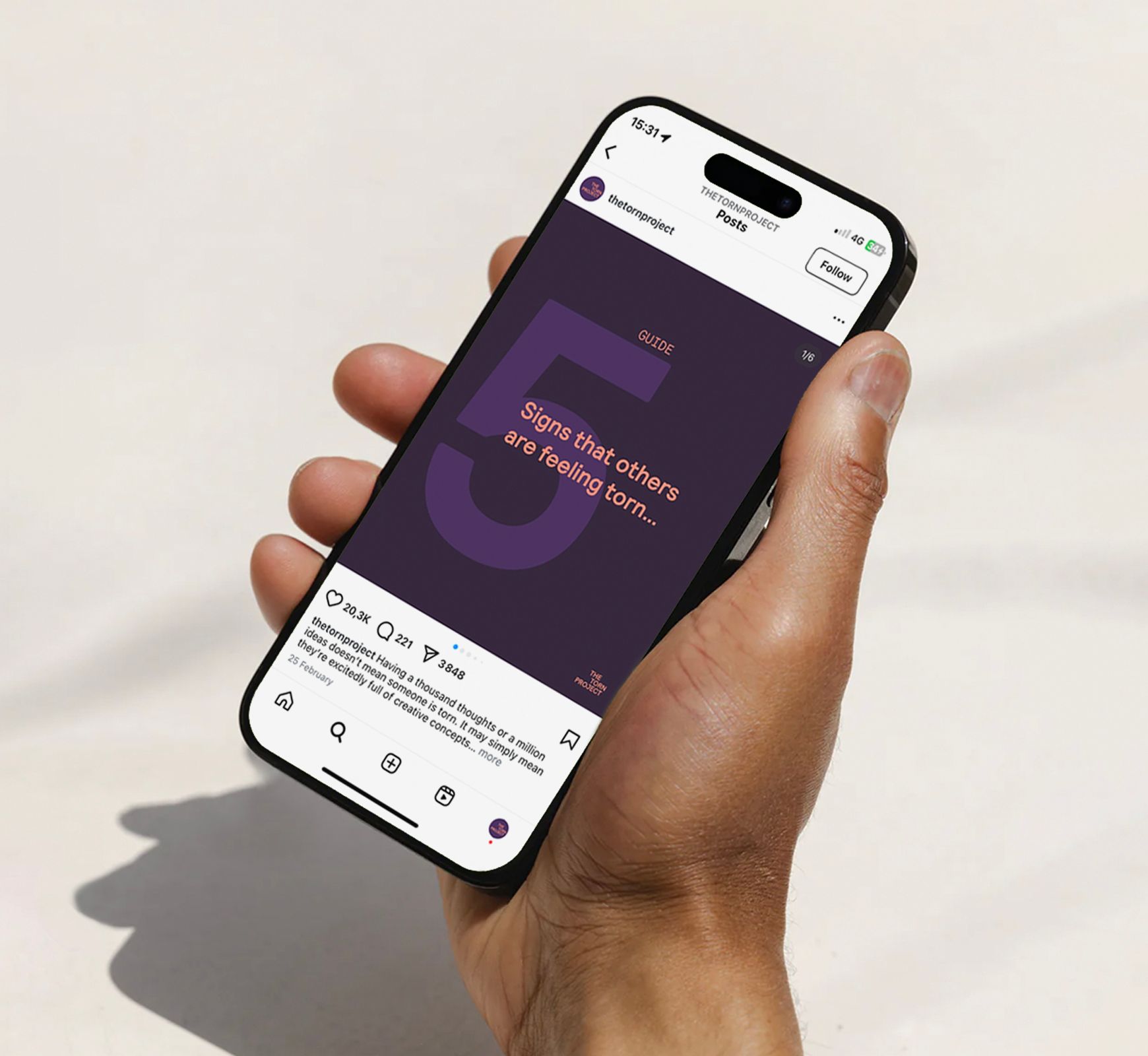
Our modular social media layouts adapt to every storytelling format, ensuring that each post—whether a raw confession, a practical tool, or a moment of hope—delivers visual impact while maintaining a cohesive, instantly recognizable brand presence.
- Services
Brand Positioning
Brand Story
Brand Identity
Art Direction
Photography
Videography
Webdesign
Social Media Strategy - With & For
The Torn Project:
Susan Quilliam,
Caitlin Cockerton,
James Knight - Team
Creative & Art Direction: Elvira Barriga
Photography & Videography: Christiane Patić
Design & Animation: Flora Vander Poorte